Sketch, Wireframes, Prototypes, and more: A question of fidelity

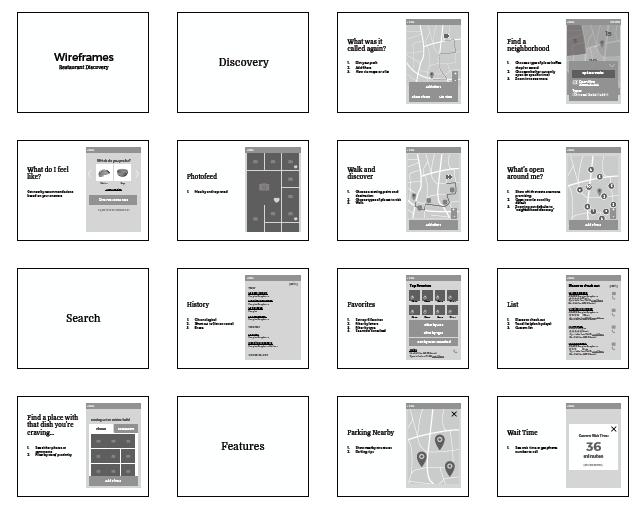
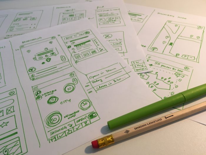
I would love to say that I seamlessly transitioned from ideation to producing wireframes. As I cannot, I will take the opportunity to explain how I eventually made this transition by better understanding the differences between sketches, wireframes, prototypes, and mockups (comps). Also, it’s a reminder of why hands-on practice is needed to fill in the gaps that theory often cannot bridge.

So why did I need to learn the distinctions between sketches, wireframes, prototypes, and mockups to make wireframes? The reason is that they’re all similar and really only differ in fidelity (or how much resemblance there is to an actual, polished product). As I read articles about wireframes to get tips, everyone had a slightly different approach to what a wireframe was exactly.

The difficulty is that with the exception of mock-ups, the other three– sketches, wireframes, and prototypes– can be executed with various levels of fidelity, which at each extreme makes them begin to resemble each other. A hi-fidelity sketch begins to resemble a typical wireframe. An “interactive” wireframe is a prototype, even if that means manually moving papers around in front of the user. Continue reading “Sketch, Wireframes, Prototypes, and more: A question of fidelity”

Keynote for Wireframing

For wireframing, I decided to use Keynote instead of just hand sketching. I did supplement with vectors made in Affinity Designer however. But for the most part, my screens were made in Keynote.

Although colors are limited, the drawing type/tools and customizing objects are intuitive and quite rich. In fact, the shapes include lots of useful icons, like cameras and maps. This allowed for creating clean layouts with visual hints quickly.

Keynote made wireframing for my Aquent Gymnasium UX Fundamentals course project quick and easy!

Keynote gets two thumbs up from me for wireframing!

Challenging myself with Daily UI and Sharpen.design

A weakness of user group interviews is that the opinions given may differ from those expressed without others present. A common occurrence is findings are skewed because one or two vocal participants end up dominating the conversation. Most people tend to keep their opinions to themselves and just nod in agreement.

However, put a group of people online and discord and disagreement are all but guaranteed. Even the most well meaning initiatives find loud, vociferous critics. That’s how I discovered Sharpen.design. In a Quora post looking for design challenges, someone completely put down Daily UI while touting Sharpen.design.

For this individual, Daily UI placed too few constraints and results were only alluring but ultimately useless designs. Sharpen.design imposes the media and client, which apparently makes it infinitely superior.

While I could understand this shortcoming of Daily UI, I also saw its strong points that Sharpen neglects. Daily UI’s strength comes in creating accountability, through its daily exercises and call for sharing work with peers. Also, for those wanting to practice designing UI elements, the projects are more pertinent.

Instead of choosing one or the other, however, I decided to merge the ideas together. I would follow Daily UI’s prompts to guide me and keep me accountable, but also add in prompts found on Sharpen.design to add some interesting constraints.

For me, it’s not about finding the best tool and choosing one over another. The key is figuring out the pains and frustrations and coming up with a solution, often hybrid, that addresses those issues.

Check out Daily UI designs on Dribbble or Sharpen.design visuals on Twitter.

Daily UI: #006 A User Profile

A month ago, I began the Daily UI challenge.

Since I’m posting Day 6, you may have guessed right in that I failed in keeping the rhythm. What’s worse is that the challenges include for rest on the weekend.

However, as usual, I bit off more than I could chew. I wanted to work UX lessons into my activities. It was fun to think about potential useful ways to get more out of a profile, such as through skill sharing on ed-tech websites like Coursera. The problem was that after several interviews, my idea was no good. Unwilling to let it go right away, I allowed myself to get sidetracked with other projects.

Finally, last night, I could no longer ignore that, like learning languages or getting better at a sport, it’s best to work on several aspects simultaneously and that fear of mediocre output is a self-fulfilling prophecy. So I’m picking it up again. Day 6. Done.

There’s lots to improve obviously (color, typography, grouping…), but I learned another important lesson these last few weeks. I can keep working on the profile almost indefinitely. Or I can learn from it and apply those lessons onto my next few projects, wherever applicable. I chose the latter.

Motivational Links: Blog as a beginner and Don’t plan too much

If You Want to Be Successful, Don’t Spend Too Much Time Planning: A Case Study

This Forbes article explains why it’s futile to spend too much time with research and preparations. For me, it underlines the beauty of the iterative process and helps fight perfectionism/procrastination/imposter syndrome by advocating the -act-learn-build-repeat mindset. We act, learn from our actions, rebuild based on those lessons, and repeat by acting once more. The advice makes a lot of sense because the constant change in the world often renders preparation useless.

Why You Should Blog About Learning Coding

Mikke Goes encourages beginners, especially beginning coders, to blog despite their lack of knowledge at the outset. For him, writing about his process was the most efficent method for improvement. He also acknowledges naysayers by admitting that it was not always easy and his views were wrong on occasion, but that the advantage of blogging: even negative or critical feedback could nudge him on the right course.

The benefits to blogging even as a beginner are as follows:

  • Gathering thoughts and clearing the mind. Instead of having all these vague ideas, which often compete for attention and prevent reaching deeper insight, putting the ideas down helps draw patterns and make room for the new.
  • Processing and awareness are a natural benefits that follows this gathering and cleaning. By rewording the information and filling in the inevitable gaps through critical thinking, referring back to the material, or further research helps cement the information. In fact, sometimes just the attempt of explaining  a problem helps discover the solution (one of my favorite lessons from a debugging class I took in sophomore year).
  • Structure is also created through the blog and helps getting back on track after short or long breaks.
  • Pride– not to confused with hubris– is also an offshoot of blogging as a beginner. By seeing what we struggled with months ago, we get a sense of pride of having conquered that.
  • Community. It’s easy to feel alone and stupid when we begin. But by speaking up, we show others that they are not alone. Sometimes it’s even easier to learn from someone who knows just a bit more. As stated often, we only need to be one step ahead, not be a master, to offer guidance to others. We become the friend we would have wanted. Through this we can find peers and even mentors, ready to help raise each other up. As mentioned in the last episode of the UX Intern, one of the best ways to grow is join a group of fellow designers that challenge each other to do their best.

The Key Points: Design & Prototyping from U of Minn and UCSD

Coursera has been a great source of in-depth information regarding all aspects of the UX workflow. For help on creating wireframes/prototypes (wireframes inform prototypes), I recently learned about design principles from University of Minnesota and rapid prototyping from UCSD (U of Minn has great resources on prototyping also). Continue reading “The Key Points: Design & Prototyping from U of Minn and UCSD”

Blog plans

Although I struggle to maintain the blogging rhythm, my plans for this blog are to relegate these posts to the bottom or secondary, tertiary importance.

The reason is that my blog was created not just to chronicle my learning journey, but more importantly create a resource, first for myself and then for others, be they beginners to UX or simpy individuals curious about how the UX Design process can benefit their projects. Continue reading “Blog plans”

Idea Dumping

Last week, I posted a few pages of sketches with ideas for a restaurant discovery mobile site.

Today, I am posting yesterday’s massive ideation sketches, and what’s interesting is the difference between the two results, despite no other work done in between.

Whereas the previous set honed in on UI elements and rather specific details, this set, in the quickness of its execution, contains a wide range of ideas. Continue reading “Idea Dumping”

Ideation through Sketching

Normally, when beginning the ideation process– coming out with so many ideas– we don’t want to confine our solutions to a specific channel.

Initially, I wasn’t sure how much detail to put into my sketches. I decided eventually that I could go into detail once, or with each variation, but afterwards, the other screens wouldn’t include it or only a simplified version.

For example, for Pokémon Go players, some entrepreneurs helped them catch Pokémon automatically without going to their phone through a physical clip they keep with them which notifies them of nearby Pokemon and successful catches through lights. If they had stuck to only phone application solutions, they would have missed out on a good idea.

However, my learning project specifically asks me to design a website for a phone, so I will skip that step of imaging different channels. I’ll go directly to figuring out a mobile-first responsive website that helps users discover restaurants, cafés, bars, and other interesting finds.

The customer journey maps come in handy here. Although scenarios would have sufficed, the journey maps provide a push to come up with ideas to solve frustrations and pains. Continue reading “Ideation through Sketching”