The Difference Between Information Architecture (IA) and Navigation – June 2014, Neilsen Norman Group
The Ultimate Guide to Information Architecture – Feb 2015, Webdesigner Depot
- Architecture analogy: stock blueprints vs. custom plans

An evolving reference for user experience design
The Difference Between Information Architecture (IA) and Navigation – June 2014, Neilsen Norman Group
The Ultimate Guide to Information Architecture – Feb 2015, Webdesigner Depot
App Design Guidelines For High-Performance Mobile User Experiences – July 2011, Smashing Magazine
For wireframing, I decided to use Keynote instead of just hand sketching. I did supplement with vectors made in Affinity Designer however. But for the most part, my screens were made in Keynote.
Although colors are limited, the drawing type/tools and customizing objects are intuitive and quite rich. In fact, the shapes include lots of useful icons, like cameras and maps. This allowed for creating clean layouts with visual hints quickly.
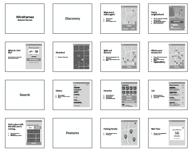
Keynote gets two thumbs up from me for wireframing!
A weakness of user group interviews is that the opinions given may differ from those expressed without others present. A common occurrence is findings are skewed because one or two vocal participants end up dominating the conversation. Most people tend to keep their opinions to themselves and just nod in agreement.
However, put a group of people online and discord and disagreement are all but guaranteed. Even the most well meaning initiatives find loud, vociferous critics. That’s how I discovered Sharpen.design. In a Quora post looking for design challenges, someone completely put down Daily UI while touting Sharpen.design.
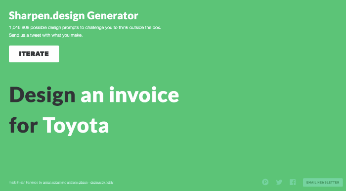
For this individual, Daily UI placed too few constraints and results were only alluring but ultimately useless designs. Sharpen.design imposes the media and client, which apparently makes it infinitely superior.
While I could understand this shortcoming of Daily UI, I also saw its strong points that Sharpen neglects. Daily UI’s strength comes in creating accountability, through its daily exercises and call for sharing work with peers. Also, for those wanting to practice designing UI elements, the projects are more pertinent.
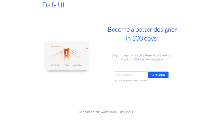
Instead of choosing one or the other, however, I decided to merge the ideas together. I would follow Daily UI’s prompts to guide me and keep me accountable, but also add in prompts found on Sharpen.design to add some interesting constraints.
For me, it’s not about finding the best tool and choosing one over another. The key is figuring out the pains and frustrations and coming up with a solution, often hybrid, that addresses those issues.
Check out Daily UI designs on Dribbble or Sharpen.design visuals on Twitter.
If You Want to Be Successful, Don’t Spend Too Much Time Planning: A Case Study
This Forbes article explains why it’s futile to spend too much time with research and preparations. For me, it underlines the beauty of the iterative process and helps fight perfectionism/procrastination/imposter syndrome by advocating the -act-learn-build-repeat mindset. We act, learn from our actions, rebuild based on those lessons, and repeat by acting once more. The advice makes a lot of sense because the constant change in the world often renders preparation useless.
Why You Should Blog About Learning Coding
Mikke Goes encourages beginners, especially beginning coders, to blog despite their lack of knowledge at the outset. For him, writing about his process was the most efficent method for improvement. He also acknowledges naysayers by admitting that it was not always easy and his views were wrong on occasion, but that the advantage of blogging: even negative or critical feedback could nudge him on the right course.
The benefits to blogging even as a beginner are as follows:
Coursera has been a great source of in-depth information regarding all aspects of the UX workflow. For help on creating wireframes/prototypes (wireframes inform prototypes), I recently learned about design principles from University of Minnesota and rapid prototyping from UCSD (U of Minn has great resources on prototyping also). Continue reading “The Key Points: Design & Prototyping from U of Minn and UCSD”
As a graphic designer, I did not expect to learn much from an “Introduction to Typography” course. However, I was reminded about how self-taught practitioners differ from those who received formal education in the field: a wide breadth of knowledge and tools.
I knew about leading/letting, kerning, smart quotes, line length, and many other typographic concepts, but it was interesting to see them being applied to change the feel and legibility of text. I had played with all of these, but using my untrained intution has always led to unpredictable results.
I enjoyed learning about the history of different typefaces too. The explanations underscored truly how fonts differ and why certain ones work so well with specific industries or fields.
Another interesting portion was seeing the use of grids and greeking (lines of varying heights, lengths, and shades to represent text) to analyze how text flows together, especially on a page. The simplication using grids and greeking made the principles stand out. All the examples and their dissection were my favorite part of the course.
Finally, I loved the tip about not using these tools and concepts immediately in order to not constrain creativity. For grids especially, he recommended playing with placement and only overlaying the grid after to clean up the arrangement.
I can’t wait to apply these concepts to my future UX deliverables!
The UX Intern was a podcast series from 2004 that lasted for a year during which a new UX intern was interviewing experts in the field for general advice, hiring tips, and their own journeys. After a year, he decided to wrap up his series and it was poetic as he had moved up as a junior UX designer.
While most UX podcasts talk about current trends, their audience is wider and topics have to appeal to both seasoned veterans and burgeoning neophytes. As a result, digger deeper into certain subjects, like how to get noticed or hired starting out, are rare occurrence. That was not the case with The UX Intern.
Below, you’ll find some highlights and quotes from this excellent series made for aspiring UX designers. Note that I did not attribute quotes to the wondrous designers offering the advice as the episode did not identify each and every person that spoke and I don’t want to attribute credit inequitably.
“Remembering it’s ok to not know everything. Even the really great experts know they don’t know everything. And that not knowing everything is a gift. Understanding that is really valuable. Continue reading “The Key Points: The UX Intern”