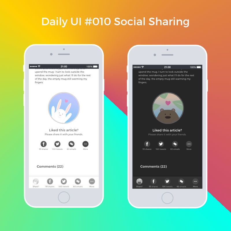
Daily UI #010 Social Sharing
Daily UI #009: Music Player
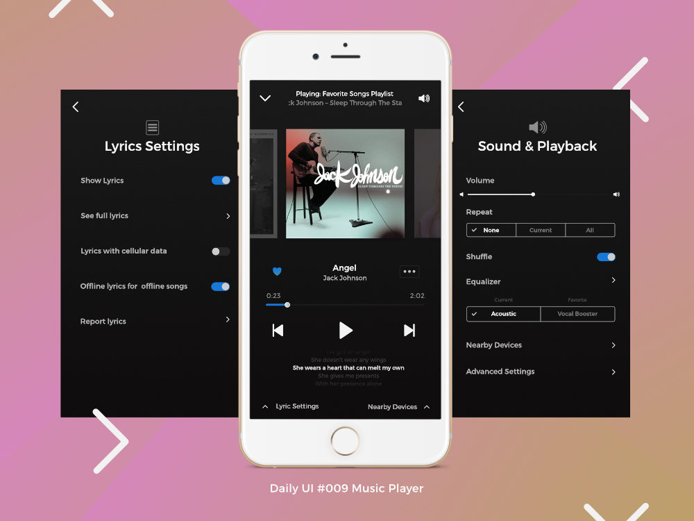
Details under the fold: Continue reading “Daily UI #009: Music Player”
Daily UI #008 404 Page

I remember back in the day when simply having a customized 404 page was fancy. Now with UX, we strive to further reduce the frustration coming from a broken link. The goal, according to this great article on UX and 404 pages from Justinmind, is to keep users moving, onto different parts of the website.
I thought their idea of having the search bar in addition to several links to be useful. I decided to add a random fact about tea as a easter egg to make even errors a bit more fun.
Although not mentioned, and potentially hard to do, it would be interesting to propose content based on the faulty URL.
For example, if the link points to a blog post, then it could be useful to link to the blog page as well as several blog posts with similar ideas (results from a search of terms in the URL perhaps).
Daily UI #007 Settings

I need to more generous with my whitespace for the buttons.
Challenging myself with Daily UI and Sharpen.design
A weakness of user group interviews is that the opinions given may differ from those expressed without others present. A common occurrence is findings are skewed because one or two vocal participants end up dominating the conversation. Most people tend to keep their opinions to themselves and just nod in agreement.
However, put a group of people online and discord and disagreement are all but guaranteed. Even the most well meaning initiatives find loud, vociferous critics. That’s how I discovered Sharpen.design. In a Quora post looking for design challenges, someone completely put down Daily UI while touting Sharpen.design.
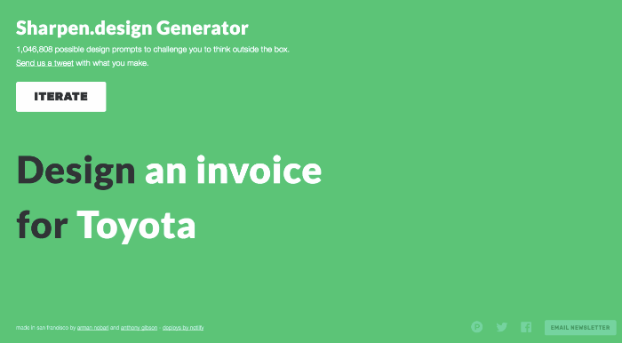
For this individual, Daily UI placed too few constraints and results were only alluring but ultimately useless designs. Sharpen.design imposes the media and client, which apparently makes it infinitely superior.
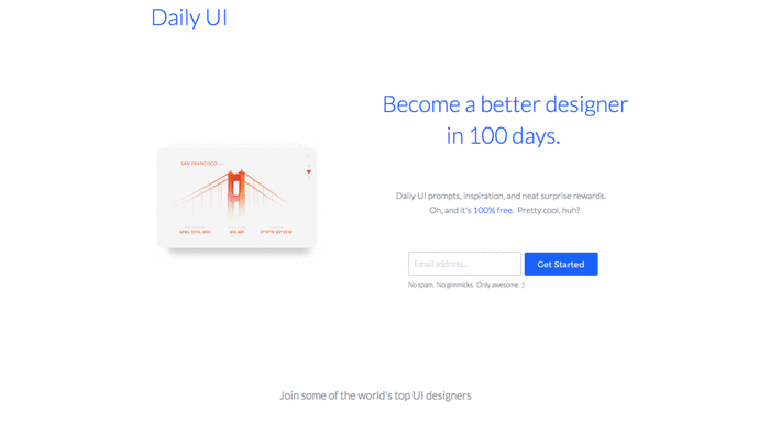
While I could understand this shortcoming of Daily UI, I also saw its strong points that Sharpen neglects. Daily UI’s strength comes in creating accountability, through its daily exercises and call for sharing work with peers. Also, for those wanting to practice designing UI elements, the projects are more pertinent.
Instead of choosing one or the other, however, I decided to merge the ideas together. I would follow Daily UI’s prompts to guide me and keep me accountable, but also add in prompts found on Sharpen.design to add some interesting constraints.
For me, it’s not about finding the best tool and choosing one over another. The key is figuring out the pains and frustrations and coming up with a solution, often hybrid, that addresses those issues.
Check out Daily UI designs on Dribbble or Sharpen.design visuals on Twitter.
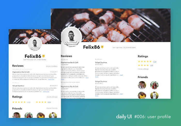
Daily UI: #006 A User Profile
A month ago, I began the Daily UI challenge.
Since I’m posting Day 6, you may have guessed right in that I failed in keeping the rhythm. What’s worse is that the challenges include for rest on the weekend.
However, as usual, I bit off more than I could chew. I wanted to work UX lessons into my activities. It was fun to think about potential useful ways to get more out of a profile, such as through skill sharing on ed-tech websites like Coursera. The problem was that after several interviews, my idea was no good. Unwilling to let it go right away, I allowed myself to get sidetracked with other projects.
Finally, last night, I could no longer ignore that, like learning languages or getting better at a sport, it’s best to work on several aspects simultaneously and that fear of mediocre output is a self-fulfilling prophecy. So I’m picking it up again. Day 6. Done.
There’s lots to improve obviously (color, typography, grouping…), but I learned another important lesson these last few weeks. I can keep working on the profile almost indefinitely. Or I can learn from it and apply those lessons onto my next few projects, wherever applicable. I chose the latter.
Daily UI #003 : Landing Page