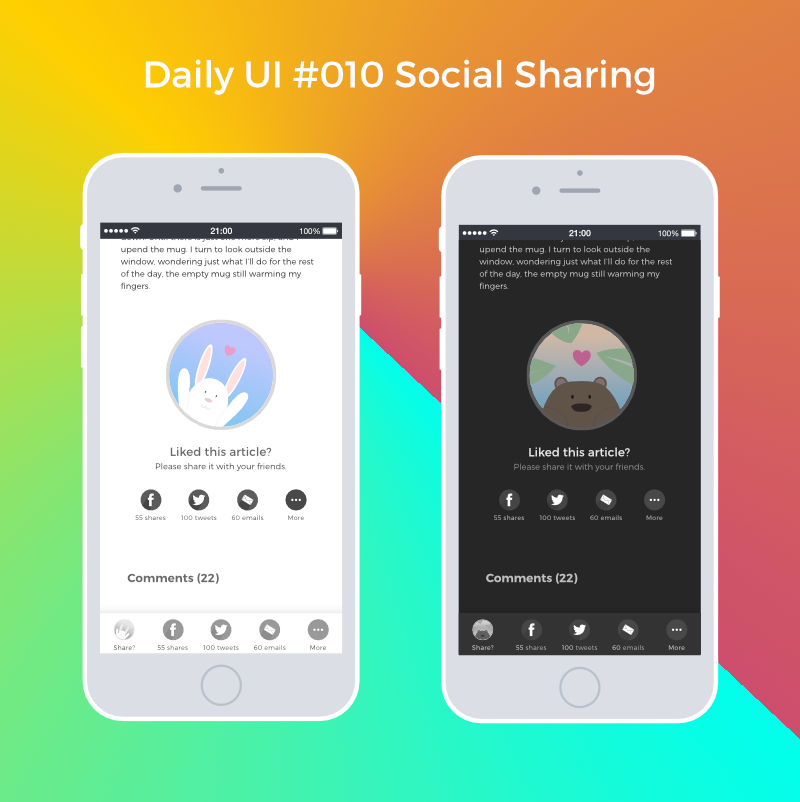
Daily UI #010 Social Sharing
Daily UI #009: Music Player
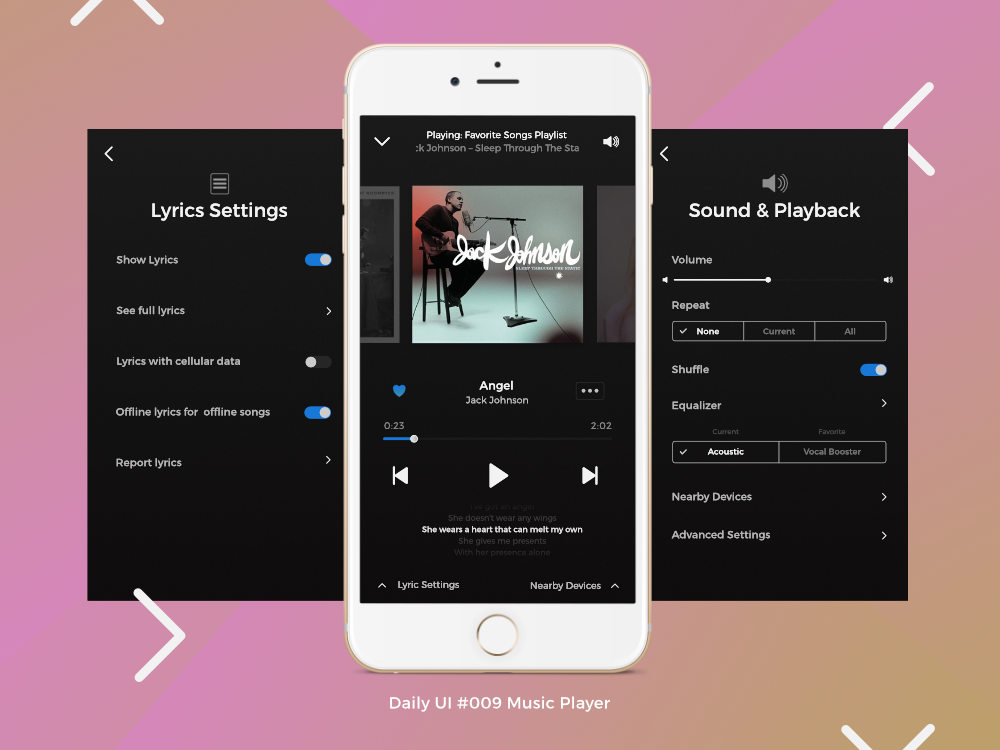
Details under the fold: Continue reading “Daily UI #009: Music Player”
Daily UI #008 404 Page

I remember back in the day when simply having a customized 404 page was fancy. Now with UX, we strive to further reduce the frustration coming from a broken link. The goal, according to this great article on UX and 404 pages from Justinmind, is to keep users moving, onto different parts of the website.
I thought their idea of having the search bar in addition to several links to be useful. I decided to add a random fact about tea as a easter egg to make even errors a bit more fun.
Although not mentioned, and potentially hard to do, it would be interesting to propose content based on the faulty URL.
For example, if the link points to a blog post, then it could be useful to link to the blog page as well as several blog posts with similar ideas (results from a search of terms in the URL perhaps).
Daily UI #007 Settings

I need to more generous with my whitespace for the buttons.
Daily UI: #006 A User Profile
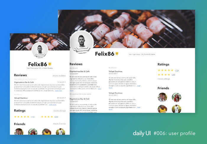
A month ago, I began the Daily UI challenge.
Since I’m posting Day 6, you may have guessed right in that I failed in keeping the rhythm. What’s worse is that the challenges include for rest on the weekend.
However, as usual, I bit off more than I could chew. I wanted to work UX lessons into my activities. It was fun to think about potential useful ways to get more out of a profile, such as through skill sharing on ed-tech websites like Coursera. The problem was that after several interviews, my idea was no good. Unwilling to let it go right away, I allowed myself to get sidetracked with other projects.
Finally, last night, I could no longer ignore that, like learning languages or getting better at a sport, it’s best to work on several aspects simultaneously and that fear of mediocre output is a self-fulfilling prophecy. So I’m picking it up again. Day 6. Done.
There’s lots to improve obviously (color, typography, grouping…), but I learned another important lesson these last few weeks. I can keep working on the profile almost indefinitely. Or I can learn from it and apply those lessons onto my next few projects, wherever applicable. I chose the latter.
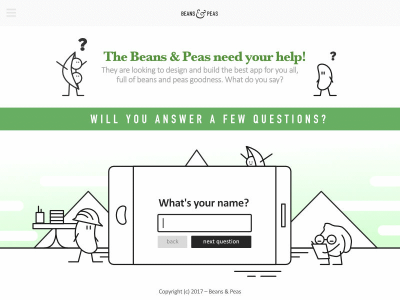
Daily UI #003 : Landing Page