
For a long time, I struggled with deciding how to go about creating wireframes. I had already gone through the ideation through sketching process and then refined the most promising ideas with tighter sketches. At that point, was wireframing just about making everything neat and fit on a screen? Yes and no.
Yes, because wireframes take the medium or channel in account, so the sketches would now have to fit in a screen. Any scribbled lines should also be fleshed out to represent what it is.
No, because the purpose of a wireframe is to see if the idea is interesting to users and what is needed to execute the idea. Thus, the wireframe is only neat and detailed enough so that relevant text (like those on buttons) can be deemed useful or not useful by users and clients.
With wireframes, it’s time to think about how everything is laid out– in addition to thinking about what the aforementioned everything entails (information architecture). If I have a map, what interaction is allowed? I can also think about the flow and what screens follow certain actions. This then produced wire flows.
As we are focusing on content, layout, and functions, designers must make sure not to distract the user with other not determined aspects yet like visual design.
First of all, time would be wasted if a user expressed displeasure with the aesthetics. You would also be wasting time that could have been spent elsewhere, like wireframing more screen, considering interactions, or recruiting more users. Also, clients may reject designs because they think the wireframe is representative of product’s final appearance.
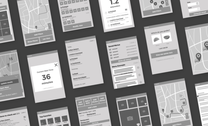
Therefore, there are several tricks to use to make sure people know that the wireframe has not been styled visually yet (or at least not for aesthetics).
- grayscale: don’t spend time choosing colors
- sketchy style: uneven lines can reinforce the feeling that the design isn’t final
- simple buttons
- one basic font
- greeking: lines to represent text or filler text like lorem ipsum can prevent users commenting on typos or the tone of copy that hasn’t been worked on yet
- add just enough detail that removing it would be detrimental
Some recommend using a box with a large X, but I find this too abstract. When I have generic photos like for a gallery, this is fine. However, when the content highly influences the interaction, like choosing between two pictures, I think that we are burdening the user’s imagination. However, I don’t like filler text like lorem ipsum as I find it busy without adding much. To me, greeked text with lines is preferable.
My next steps are to show this to a few potential users and stop worrying about how to set up the navigation by conducting a few open card sorts with users.