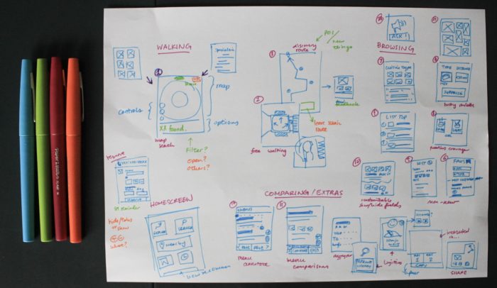

Last week, I posted a few pages of sketches with ideas for a restaurant discovery mobile site.
Today, I am posting yesterday’s massive ideation sketches, and what’s interesting is the difference between the two results, despite no other work done in between.

Whereas the previous set honed in on UI elements and rather specific details, this set, in the quickness of its execution, contains a wide range of ideas.
Having more variety in ideas is beneficial because one must not forget the importance in testing with users and ignoring that we are not the user. Thus, all that time spent figuring the exact number of buttons to show and where to place them may be for naught when the user isn’t impressed. Furthermore, with lots of ideas explored, paper prototypes can be created on the fly quicker mixing user input and left out ideas.
I did not realize this immediately. Actually, I was researching (procrastinating) about UI principles and wireframes to work from my sketches. I got caught up with which buttons should be where. All the videos I watched about design and prototyping were painting in broad strokes. They talked about flow, grouping, and consistency. As I discovered where another tool fit, that of storyboards, I realized that I would have no one-size-fits-all solution.
The key is to create wireframes to inform rapid paper/digital prototypes for testing. There’s no way around it. All the information and tips in the world can only save minor time with educated guesses like avoiding dropdowns with less than 5 elements. On that note, I could keep looking up different tips, pitfalls to avoid, and general guidelines, but the core focus should be on presenting the designs.
So I will get to apply what I discovered when I was a user being tested. I will present different landing pages with features to get feedback. I’ll keep it loose to stay away from discussions on aesthetics and focus on functionality.
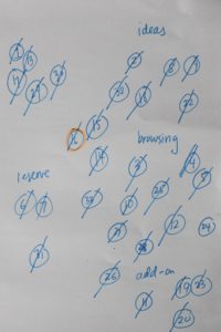
How do we go from ideation to that though? Well, one course mentioned rating and merging ideas based on values/criteria identified in user testing. However, as I have limited myself to a mobile website, I have less to make anyways, so I just did a cluster diagram of my ideas before redrawing simple screens or fragments of the ideas.